Front-End Design - Responsive Portfolio Website
Overview
Create a responsive portfolio website to learn the basics of front-end design.
Purpose
My goal for this project was to learn and apply the basics of HTML, CSS and JavaScript. Since I had already completed my portfolio website with the help of a builder, I created this website to be an MVP (minimum viable product). I wanted to bring my branding style over to this project, creating a different option.
My overall goal for this project was to understand the capabilities of the basic languages of coding and how they interact. As a UX designer, this helps me communicate effectively with developers. I wanted to understand how the code affected the design. So I used the W3C validator to find and practice fixing errors throughout the project. I also used developer tools to help me consider various screen sizes as I developed the design.
Problem
The suggested basic structure for this website was handed off to me at the beginning the project, including wireframes, information architecture, and features. There were some areas where I chose to customize the content and layout. I relied on advice from my mentor to create those changes, to understand what I needed to do, and most importantly, why.
Challenge
I search for the “why” of how things work - seeing changes take effect and troubleshooting issues teaches me the most.
I had no previous coding experience. I learned these tools:
Atom code editor
Linter plug-ins
Chrome web inspector
W3C validators
GitHub & GitHub Pages
My Roles
Front-End Designer
UX Designer
UX Researcher
Timeline
6 months
My Process
Research
Explored similar portfolio websites for inspiration
Decided on a basic information architecture plan:
Home Page with links to projects
About Me page
Project pages
Contact information in the footer
Gathered images for my pages, then formatted, re-sized and organized them in the project file
Design
Designed layouts with a mobile first approach, and used developer tools to validate design choices for different screen sizes
Used CSS keyframes to animate an SVG and highlight it as one of my projects
Used JavaScript to create a responsive navigation menu
Iteration
Performed user tests: 5 participants with various backgrounds in technology and hiring.
Goal of user testing was to determine ease of navigation, and functioning of the contents and features.
Iterations after user testing:
move/add buttons
adjust CSS to correct layout issues and image sizes on mobile screens
Adjustments after code quality review:
fix HTML to correct an image that was not appearing on some browsers
Accessibility Review: Color
During the color review:
Changed several elements’ colors, borders, and states for consistency
Changed hover state color on nav menu links to increase contrast
Adjusted turquoise color for text links to provide better contrast with body text
Button color and text adjusted to WCAG AA
Result
The result of this project is a responsive website that showcases my UX projects, conveys my brand style, and provides ways for hiring managers to connect with and contact me.
As part of my design process, I performed user testing with 5 participants, analyzed the results, and planned for the next iteration. The code has been checked by linters and tested using a variety of browsers.
Highlights:
Mobile first approach includes breakpoints for mobile, tablet and desktop
CSS provides a sticky navigation bar at the top
JavaScript provides a responsive menu that changes to a hamburger menu at smaller screen sizes
Page footers contain contact information and social media links
Home page contains links to my UX design projects
Dedicated page for my resume and more about me
Solution: Home Page
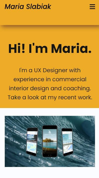
Mobile

Tablet
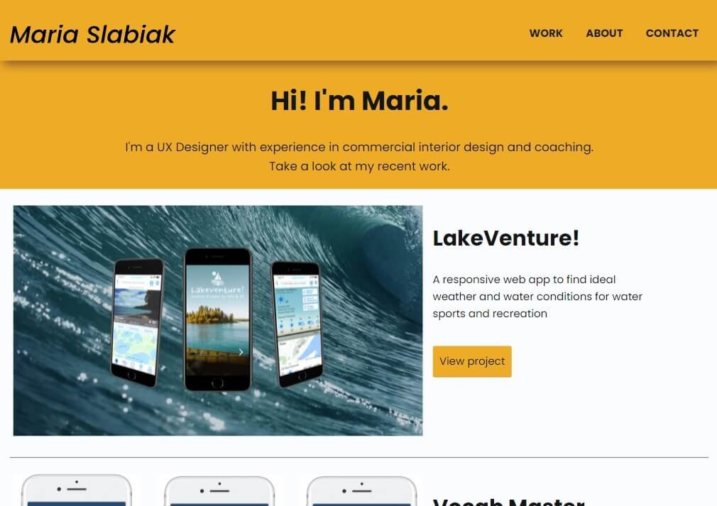
Desktop
Solution: Project Page
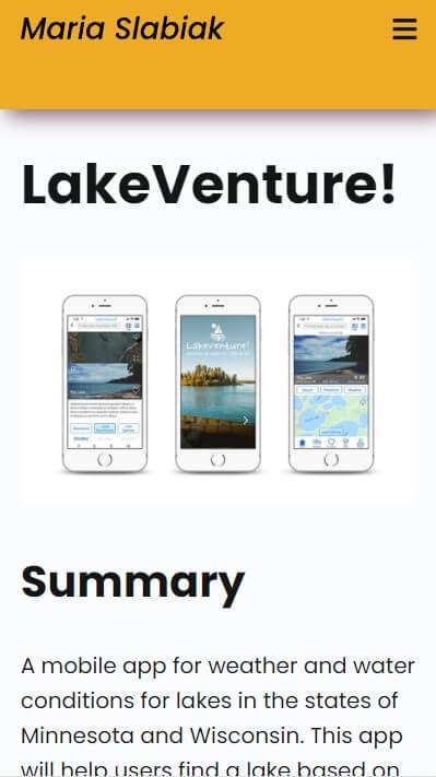
Mobile
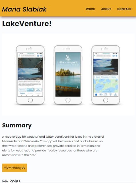
Tablet
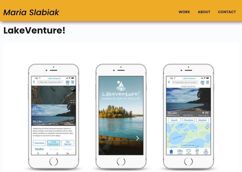
Desktop
Solution: About Me Page
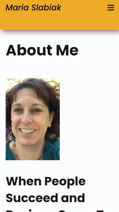
Mobile
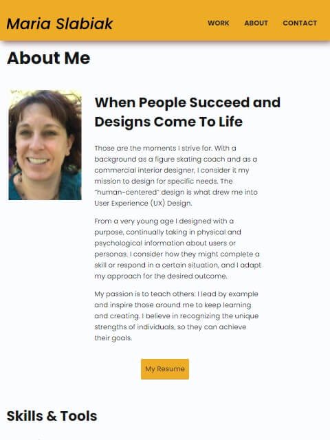
Tablet
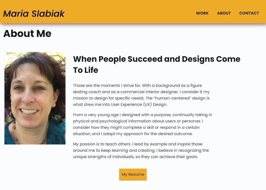
Desktop
Retrospective
Although I still have a long way to go as a front-end designer, this project showed me how the basic coding languages work and function together to create a responsive website. I’m glad I gained experience using Atom to edit code and GitHub to make the site available for user tests.
I really enjoyed meeting with a developer to explore solutions to issues. This experience has made me aware of the symbiotic relationship between web developers and designers.


