A Responsive Web App for Weather and Water Conditions
Why LakeVenture?
There are almost 30,000 lakes in the two states of Minnesota and Wisconsin in the United States. With so much populated shoreline, water recreation is a significant leisure activity.
We wanted to create an app that would ease planning and increase safety, thus creating a more enjoyable time on or near the water.
This app would not only alert users about unsafe weather, but also let them know in advance that the upcoming weather looks perfect for that sailing or fishing trip.
With customized settings for all types of water activities, we needed more than just your average weather app…

App Summary
A mobile app for weather and water conditions on lakes in the states of Minnesota and Wisconsin. This app will help users find a lake based on their water sports and recreational preferences, provide detailed information and alerts for weather, and provide nearby resources for those who are unfamiliar with the area.
The Problem
Users need a quick and reliable way to easily interpret water and weather information.
Customized for activity and location
Some information can be accessed offline or without Wi-Fi
Customizable notifications for safety and easy planning
Niche
This app could stand out a number of ways:
Customized trigger alerts for both optimal and severe weather
Focus on a limited geographic location containing a lot of lake and water areas and potential users
Provide local, trusted, accurate weather data
A free or low cost app available across devices
-
Sole UX Researcher and UX Designer
-
Figma
InVision
OptimalSort
LucidChart
Google Forms
-
Competitive Analysis
User Survey
User Interviews
User Personas
User Journey Maps
Card Sort
User Testing
Wireframes
Design System
Interactive Prototype

Project Scope
User Research | Wireframes | User Testing | Iteration
9 months
Hypothesis
“If we provide an easy, customizable way for users to access weather and water information, we can keep users safer and help them plan more enjoyable time on the water.”
User Research
Online Survey
33 responses within target audience
User Stories
Weather Data
As a user, I would like to have some ability to control what I see in my sailing weather chart because I like to look at certain data first.
As a user, I would like to be able to have several different looking map modes, so it’s easy to see in sunlight and in the dark.
App Navigation
I do several different water sports, so I want to view sport-specific weather conditions without unnecessary information for what I am doing.
As someone new to sailing, I want a safety equipment checklist that I can quickly reference and edit to make sure I have everything ready.
Onboarding
As a new user, I want an onboarding process that explains how the app uses my preferences information.
As a fisherperson, I want some customization options within the onboarding process so that I can make the app work better for me.

User Interviews
5 participants, age 29-70
Goals:
usefulness of certain features
attitudes
pain points
social media habits
Interview Quotes
“I wish [my weather app] had more accurate weather and radar. I also don’t want to pay for a weather app.”
— Pete
“I use a paper checklist for longer trips. For short trips, I use a list in my head, but often end up forgetting something.”
— Paul
“Downloadable maps with lake depth and my GPS location would be good.”
— Elise
“I don’t always plan ahead with maps. Sometimes I drive to a lake and then try to look at the lake map for the first time. If I have no service, I can’t get a map.”
— Paul
Affinity Mapping
I organized the data into 17 categories. This is a sample.
User Research Takeaways
Requested Features:
Record conditions from a previous trip
Mark a favorite spot for future private use
Downloadable lake maps and GPS
User Habits:
Manually check the weather on a daily basis for at least several days prior to a trip, including the day of and sometimes on the water
User Pain Points
Unreliable weather information from their current app
Want a free or very low cost app. If it has many features and reliable maps, then they are more likely to pay a one time fee.
User Personas
I created 3 unique personas to more closely represent research-backed user needs.
**Use carousel arrows < > below to view additional personas
User Journey Maps
I wanted to explore specific user behaviors and emotions when planning a fishing trip or a sailing outing. Creating journey maps helped identify more opportunities for features, such as allowing sport-specific “ideal” weather conditions as defined by the user.
Adam might get a message that the lake he had in mind will have his ideal weather Friday morning.
Matt could modify a safety checklist to use when taking clients sailing.
**Use carousel arrows < > below to view additional journey maps
User Task Flows
To help me shape the Information Architecture, I created these user flows to validate decisions for the site plan. These include:
Finding nearby resources
Modifying a checklist
Setting up severe weather/optimal weather alerts
**Use carousel arrows < > below to view other task flows
Site Map
I conducted an online hybrid card sort using OptimalSort to help me revise the site plan.
Respondents were provided with the main categories, with an option to create new ones. I chose a hybrid card sort to save time and because of initial positive feedback from the first draft.
The charts, lists, and visuals from the card sort helped me interpret the result data and compare it with the preliminary site map. I made some minor changes to produce the final site plan.
Wireframing
Low-Fidelity Wireframes
Since I had a lot of screens to sketch, I used the “Crazy 8’s” method. I learned I prefer to make notes in the margins and label some items, so this exercise was a bit frustrating. I now use graph paper for sketching and make notes in the margins.
Home Screen, Search Results, and Drawer Menu
Paper Prototype
This shows the Search feature to select a lake.
Using dot voting, I selected sketches and added text for clarity. I began to map out some connections to see the user flow take shape for this feature.
Main Search Screen: Search within a map area, type in the search bar, or filter by parameters.
Predictive Search: Type into the search bar to generate predictive searches.
Multiple Search Results: Download a lake map, see the location in context, or apply further filters.
Single Search Result: Map options, lake description, fish species found, options for driving directions, local businesses, and weather highlights.
Mid Fidelity Wireframes
I used several different tools to gain experience:
Figma to create digital wireframes
InVision to make a clickable prototype for usability testing
Now I could see how much information a screen could contain, and see possible opportunities to prevent information overload.

Usability Testing
Test Objectives:
Onboarding Screens - determine if participants easily understand the purpose of the app and how they might be able to use it
Identify problems with the Sign Up/Log In Screen
Complete tasks: search for a lake, view weather details, set alerts or reminders, set optimal weather conditions
Equipment Setup: Windows screen recorder for PC, Skype, and InVision.
“I would use this app even if I didn’t do these water sports.”
— Natosha
“I think it’s really cool that you can set your ideal weather.”
— Courtney
Usability Testing Results
After user testing, I categorized the observations, quotes and errors. I created a rainbow spreadsheet to find the most critical errors to iterate upon next.
The most common errors were due to:
Wording/name of a label
Button placement, missing button
Challenges During Usability Testing
Coordinate/learn unfamiliar tools for remote user testing
Audio/video recording limitations dependent upon participants’ equipment setup
All interviews took longer than planned
Multitasking - use digital tools, keep user on task, take notes, and keep an impartial tone of voice
Some glitches and poor connection moments - I continue to consult with peers using similar equipment to see what they are having success with
This test had a larger scope and more tasks - allow for enough time and budget
Post Usability Test Iterations
Preference Testing
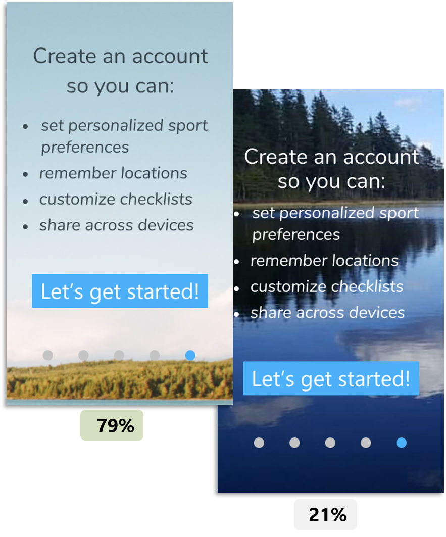
As I developed the fidelity, I conducted preference testing with UsabilityHub to get a sense of which design users might prefer.
Readability/contrast was the main issue here
Emotional reactions to color were the most frequent comments for the landing page.
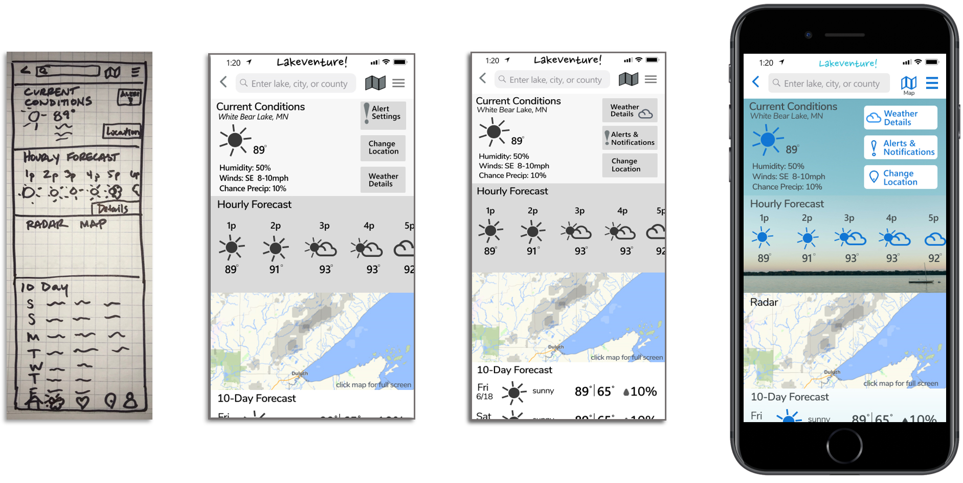
Design Progression
As I iterated to bring the screens to high fidelity, I focused on:
Gestalt principles
Grids for responsiveness and consistency
Accessibility
Peer review
Here are a few examples:
**use the carousel < > arrows to view more screens
Design System
I needed to document the design standards, but didn’t have an established format to follow. I created this combined Style Guide/Design Language System with minimal direction and a short timeline.
**use the carousel < > arrows to view more samples
Final Screens
Takeaways
Challenges
Creating custom icons and a logo added time. I experimented with Illustrator and Figma for this, using tutorials and advice from peers.
Learning wireframing and prototyping software took a lot of time. I checked in often with my tutor for design feedback and support, sought advice from peers, and used tutorials for the bulk of the learning. Now I am comfortable with plugins, UI kits, and layer naming conventions to speed up wireframing and handoff.
Next Steps
Confirm the effectiveness of labels and language
Study specific user flows to develop additional features:
Safety and Education
User Profile
Settings
Map View Filters
Confirm that maps can be adjusted by the user and that they can be read easily under various outdoor light conditions
Confirm the effectiveness of current navigation - focus on time spent on task and participant questions
Determine if the safety and education feature is valuable and utilized for specific water sports
To measure this, I would design software within the app to measure how often and how long users view video and articles. If 40% of users in a particular sport remain on the article screen longer than 20 seconds, it would be considered a useful feature.
Retrospective: Design Thinking Process for LakeVenture
The Design Thinking Process is an effective method to use. The circular iteration process allows for evaluation and creates opportunities for change. Some projects may not allow for a broad scope or timeline.
I have previous experience with user-centered design and the iterative process. Learning the point of view of users other than myself is critical for making design decisions, particularly in the beginning. Also, using the Double Diamond strategy allows me to explore many potential problems, narrow down the focus, and repeat the process for potential solutions. This approach lets me broaden my scope of ideas and not just settle on a narrow vision.
Design is an inherently ongoing process. Designers need to decide when to pause and deem it enough. As a designer, I try to be very loose and imperfect in the early stages. A lot of the early design may change during later iterations. However, sometimes stakeholders have difficulty visualizing how something will look or function, so a designer’s ability to quickly generate some higher fidelity wireframes or quick prototypes can be very useful for effective discussions.
Certain parts of the design process are extremely valuable, and most parts are tightly connected. User testing quickly makes it evident which changes are needed. Both user testing and peer review resulted in the most improved iterations for this app. The Design Thinking Process will continue to be effective in developing more features and iterations of LakeVenture.


