Website Audit & Design Recommendations
Elijah’s House, N.F.P.
Elijah’s House, N.F.P. is a non-profit organization in the Chicago area.
Elijah’s House provides:
After-school education and career development for youth and teens in culinary arts, journalism, and performance media
Events to support new parents
Special programs to strengthen relationships between youth and local law enforcement
Summary
This organization needed a website audit to prepare for a website redesign.
After an initial look at the website, I met with the Executive Director to determine:
Vision for the new website
Current marketing efforts
Strategize UX research
Define project deliverables
Scope:
User Research | Website Audit | Information Architecture | Wireframing | Design Recommendations
Duration:
5 weeks
My Roles:
UX Researcher | UX Designer
Tools:
Figma | FigJam | Google Forms | WAVE Accessibility Evaluation Tool | Screaming Frog SEO Spider Tool | Excel | PowerPoint
Deliverables:
User Survey | User Interviews | User Flows |Site Map | SEO Audit | Accessibility Audit | Design Audit | Wireframes | Action Item Checklist | Visual Guidelines
Constraints:
Short timeline with a small amount of hours per week.
Client (Executive Director) would input changes to the website and write content.
Client preferred to continue using a website builder.
Typical users:
Parents, caregivers and teen program participants
Donors
Partner organizations
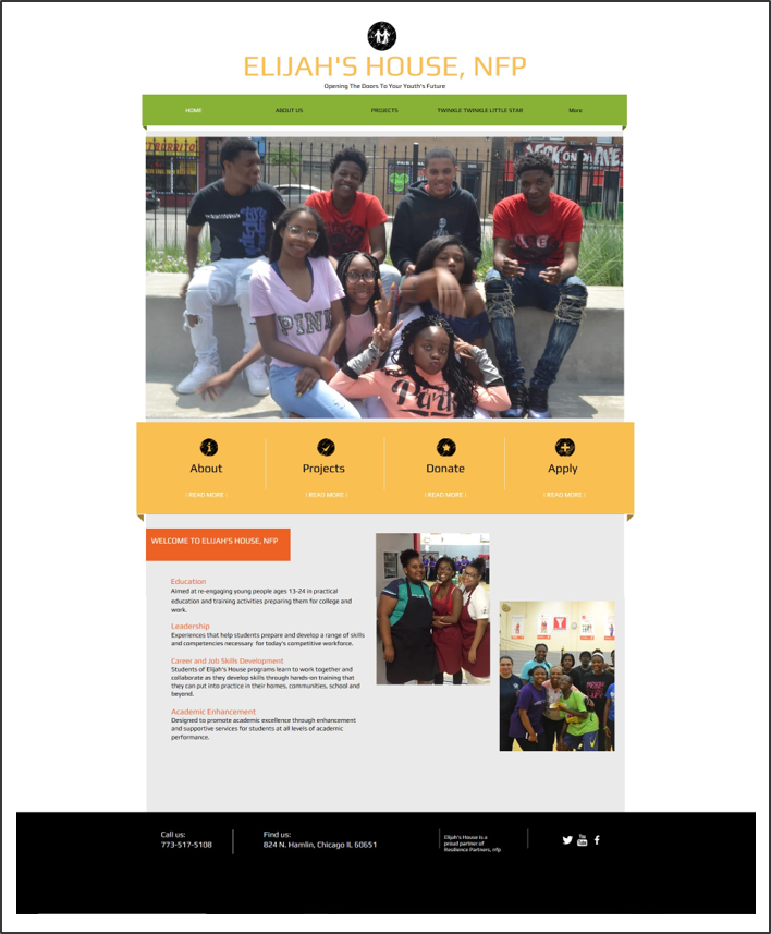
Original Website:
Home Page
About Us Page

My insights after our initial meeting:
Design Goals:
Home Page priorities: mission statement, link to programs, apply for a program, donate CTA
Visuals and color should convey a youth-focused organization
Users should feel welcomed and uplifted
Business Goals:
Attract teens from other states to participate in virtual programs
Increase awareness and participation in special events
Increase donations made through the website
Opportunities:
Social media channels could more effectively draw traffic to website
SEO and design improvements would increase usability
Involve the teen media program participants in website content creation and marketing efforts
Include testimonials from program participants and families
Insight: This website would benefit from changes in both SEO and UX Design.
Decision: Since the client would be the one making these changes instead of a developer,
I would focus on client education as part of this project, to increase the chance of long term project success.
UX Research
Online Survey
I needed to find out why and how people would visit this site, and if there was a need for a more responsive design.
I had a tight timeline for UX research, so I didn’t create personas. I asked if there were current customers who would participate in a short survey. The client provided a list of customers.
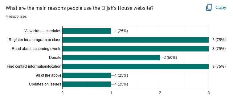
4 question Google Survey, 4 responses
Duration: 5 days
Survey Results
Common User Tasks:
Register for a program or class
Read about upcoming events
Find location or contact info
Donate
I used these tasks to generate user flows to review with the client and develop the information architecture.
Screen Sizes Used:
Mobile phone
Desktop computer
Chromebook/Laptop
iPad/Tablet
This website needs to focus on responsive design to be accessible to all users.
Since the client will be building the new website, I had to explain:
what responsive design was
why it is important to them
how to do it using a website builder
Social Media Their Users View:
Facebook
Instagram
Include links to website pages within social media posts.
Update social media links on the website.
SEO Keywords:
Youth program
Teen program
Youth assistance
Elijah’s House
These keywords could be entered in metadata and page descriptions in the website builder.
Additional Survey Feedback:
Include current social media links
Include more photography of participants and their work
Social media posts could include links to: home page, programs, application, and donation page
Use bright colors that appeal to youth/teens
User Interview
I wanted to get direct feedback about the website’s design and function from an actual participant in the teen demographic.
I asked the client if she would recommend someone connected with the program within the target demographic of 13-18. She recommended a past participant who was now leading as a program assistant.
Interview Format: E-mail
(client was copied on all communications with minors)
Duration: 1 week, including follow-up question
Interview Questions (partial list)
Which programs are you involved with?
How did you first learn about this organization?
What are the reasons you might use this website?
Can you find information you need?
At first glance, is anything on the website confusing?
What are some colors you really like - maybe in your favorite apps/websites/logos?
Do you think the Urban Girl Magazine participants would be interested in contributing to this website? If so, what could they help with?
Interview Results
This individual has used this website to:
Find out more about the organization
View upcoming projects
Apply for programs
Enjoys seeing photos of participants they recognize
Uses both laptop and phone to view this website
Wants a link to apply for a program on the Home page
Suggests more colorful, bright colors - possibly blue, green and yellow
The media program participants would be able to help with the website content
The overall results of the interview echoed the survey results:
Information architecture and navigation will be key to user satisfaction.
User Flows
The information architecture (IA) needed improvement. There were 2 very similar navigation menus, and some page and program names were unclear.
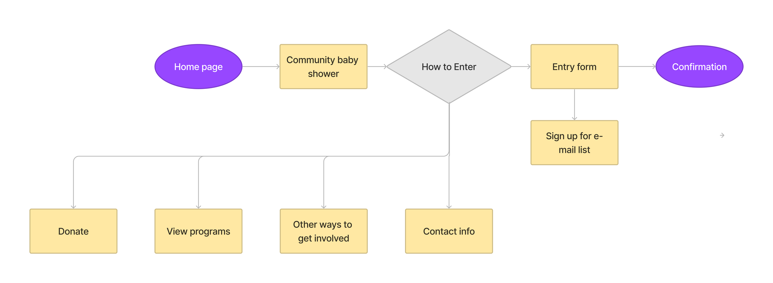
I drafted user flows for 3 scenarios to help me frame the IA.
User Flow: Making a Donation
User Flow: New Participant Registering for a Program
User Flow: Searching for Community Baby Shower Information
As the client and I talked through the user flows, I learned more about how this organization worked.
I had concrete direction for the website architecture.
Information Architecture
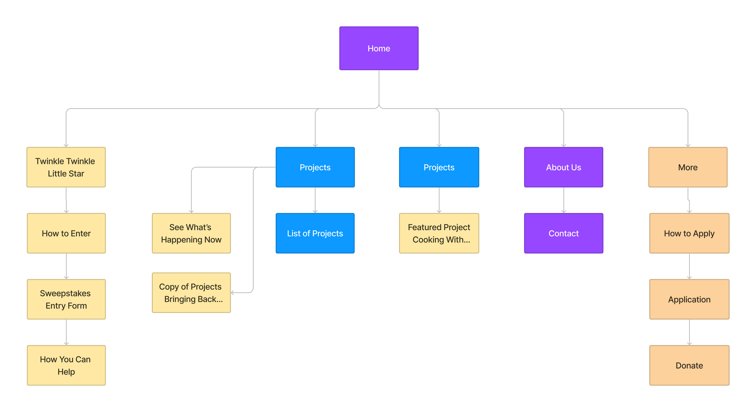
Existing Site Map
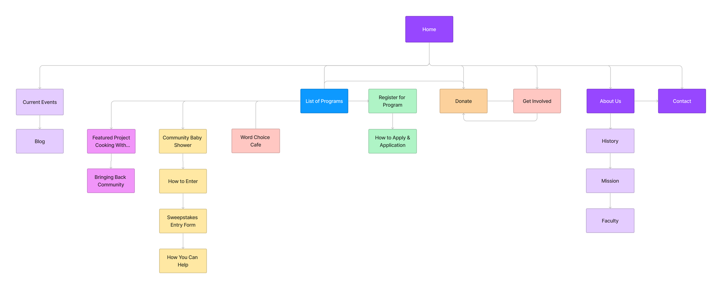
Since time was limited, I reviewed the existing site map and a draft of a proposed site plan with the client. I explained the rationale behind my proposed changes to the site plan.
Major changes I made:
Change “Projects” to “ Programs”
Rename section “Community Baby Shower”
Add Mission and History sections under the About page
Add a link from the Programs Page to Registration information
Revised Site Map
As the project progressed, I iterated upon these working documents and reviewed sections with the client as needed.
I included them as deliverables at the end of the project, so the client could reference these as she set up the new site.
Website Audit - SEO & Accessibility
Process/Tools:
I needed to find the major issues to address quickly, so I used these digital tools:
Screaming Frog SEO Spider (SEO)
WAVE tool by WebAIM (accessibility)
For now, I listed top priority items on a spreadsheet. I’d come back to prioritize and combine these during the content audit.
Although this client had some experience building parts of this website with a builder, SEO and accessibility concepts were new.
During our meetings, I introduced the basics of these concepts to the client, and briefly explained how these might be used to improve this website and this organization’s marketing.
Audit Results
Some of the items I found in the content audit overlapped with SEO or accessibility. I only listed the additional items to avoid duplication.
In total, there were over 100 action items.
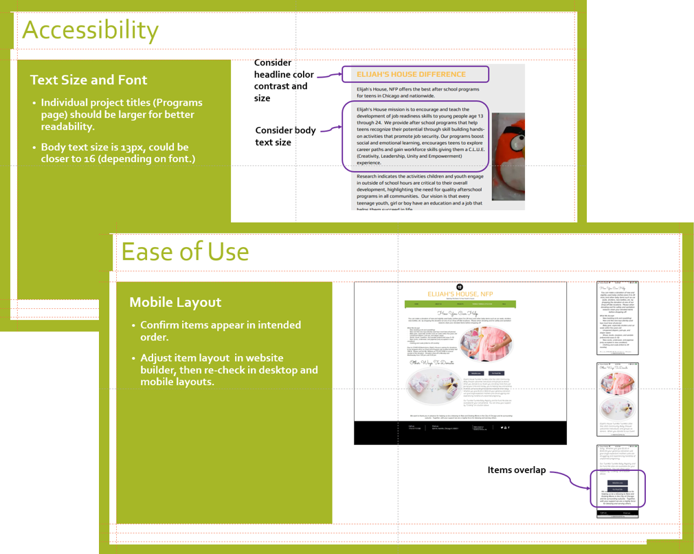
I prioritized these by color-coding, and used illustrations within the slide presentation to illustrate the critical items.
Key Findings:
Content:
Eliminate secondary navigation menu
Adjust page names and locations in top navigation
Edit portions of text or use bullets for clarity and readability
Use only one typeface style for headlines, another for body text
Add buttons or links on relevant pages
Enlarge some text for readability
SEO
Use H1 and H2 headline elements
Add descriptive page titles that contain searchable keywords
Include more keywords in the metadata
Add links to current social media pages
Accessibility
Enter alt-text as you place or edit images
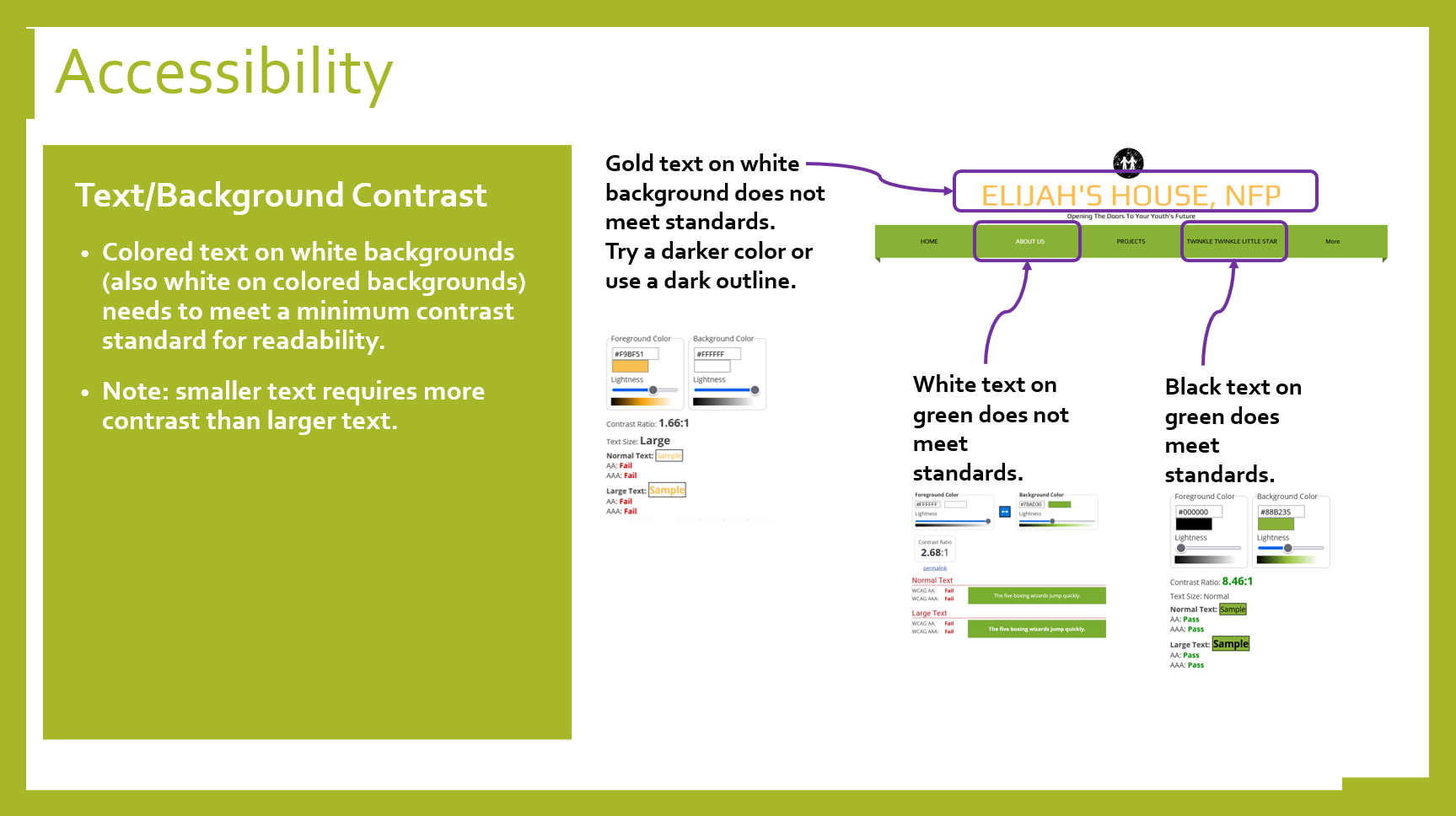
Adjust background or text colors as needed for contrast
Increase font size in the primary navigation menu
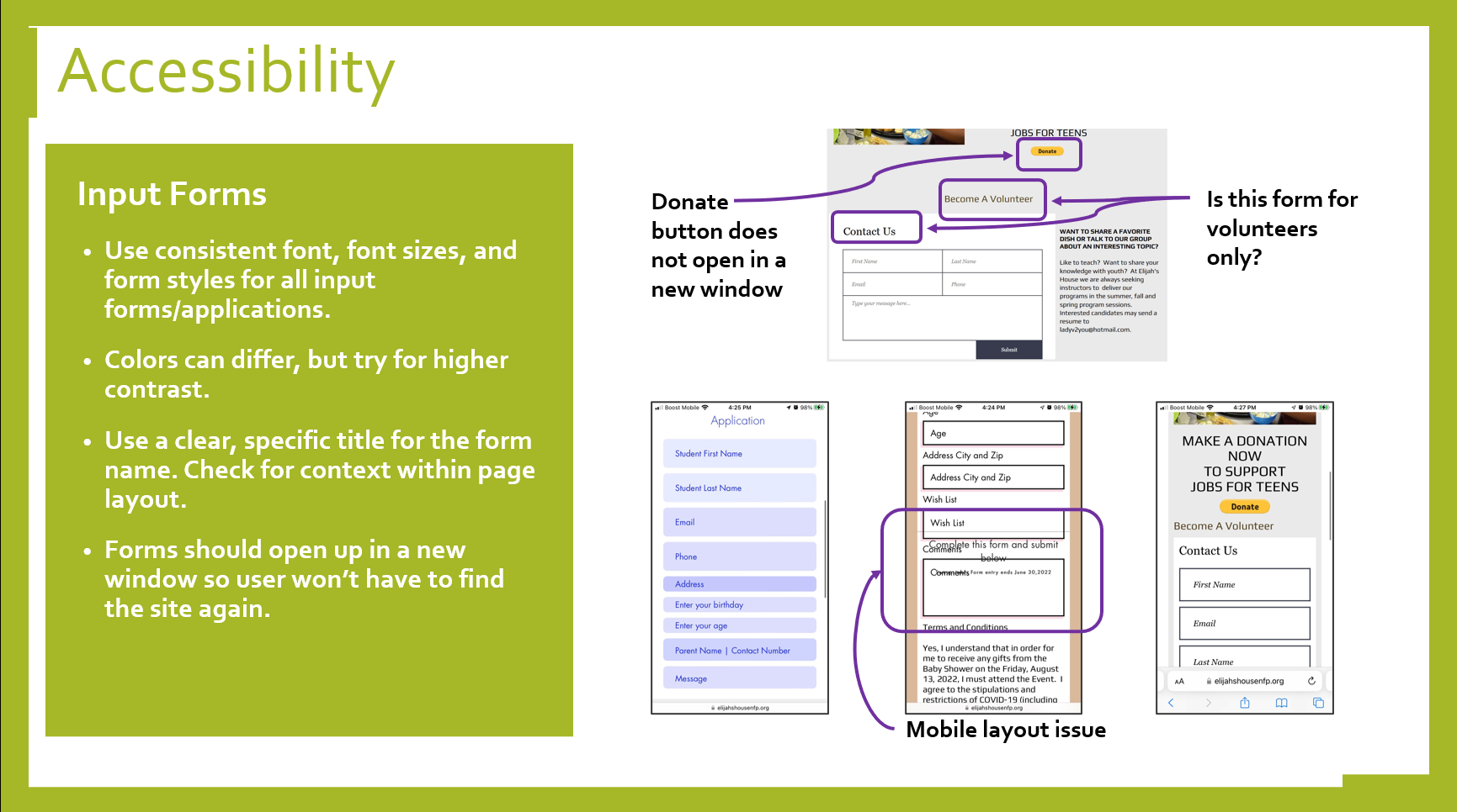
Adjust layout of elements to work on mobile screens as necessary (responsiveness)
Adjust font size as needed, using consistent headline and paragraph text
Design Recommendations
Accessibility: Text/Background Contrast
Text and background need to meet higher contrast standards (WCAG AA)
Smaller text requires more contrast than larger text
Accessibility: Input Forms
Use consistent form styles, fonts, and font sizes
Label forms with clear, specific titles
Form should open in a new window
Design
Use the logo as a link back to the home page
Utilize a “sticky” navigation bar at the top of the page
Place high priority call-to-action (CTA) buttons “above the fold”
Deliverables
1) Site Plan
Guideline for client to follow
2) Audit Results & Action Items
Separate action item list
Coded by priority
Sortable lists
3) Low-fidelity Wireframes
Guideline for client to follow
4) Slide Presentation
Illustrations
Design rationale
Wireframes
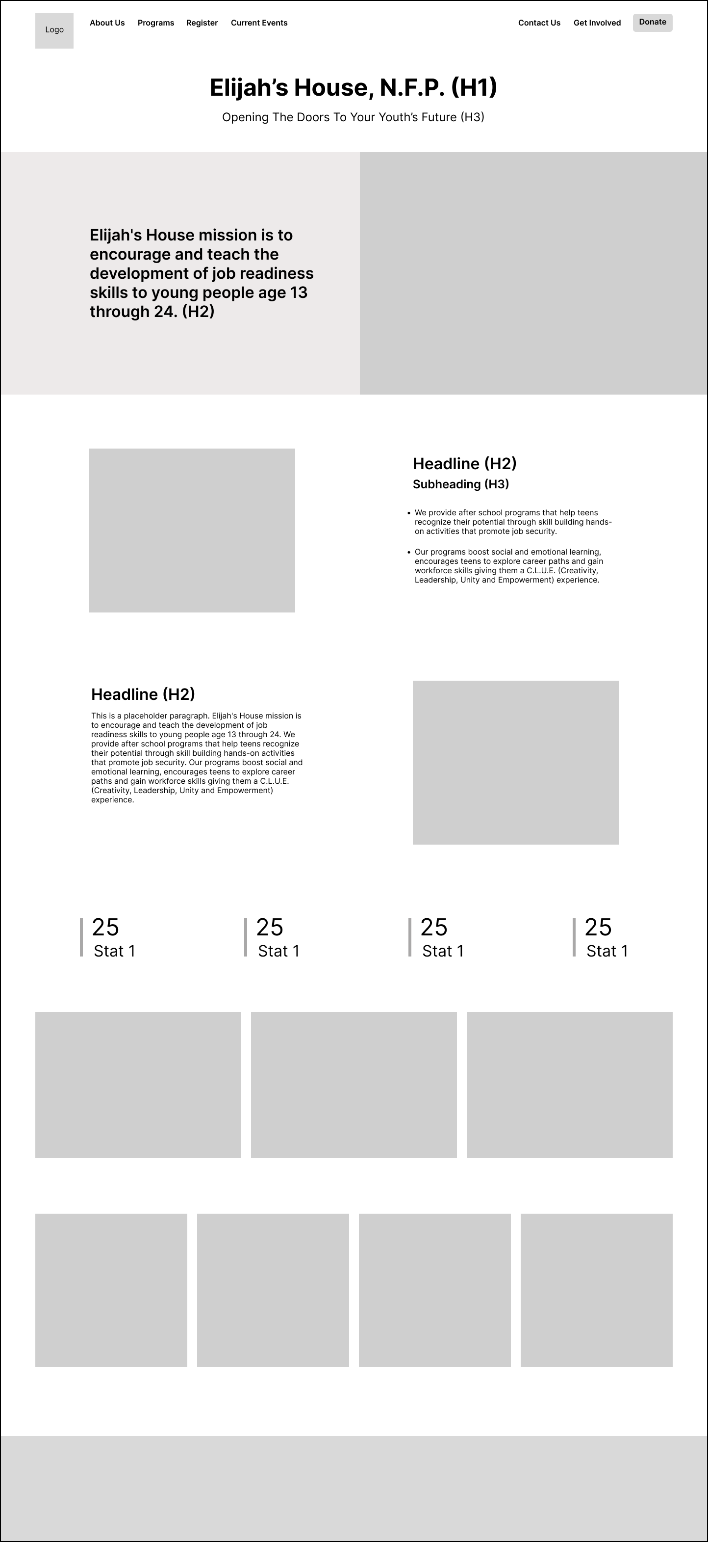
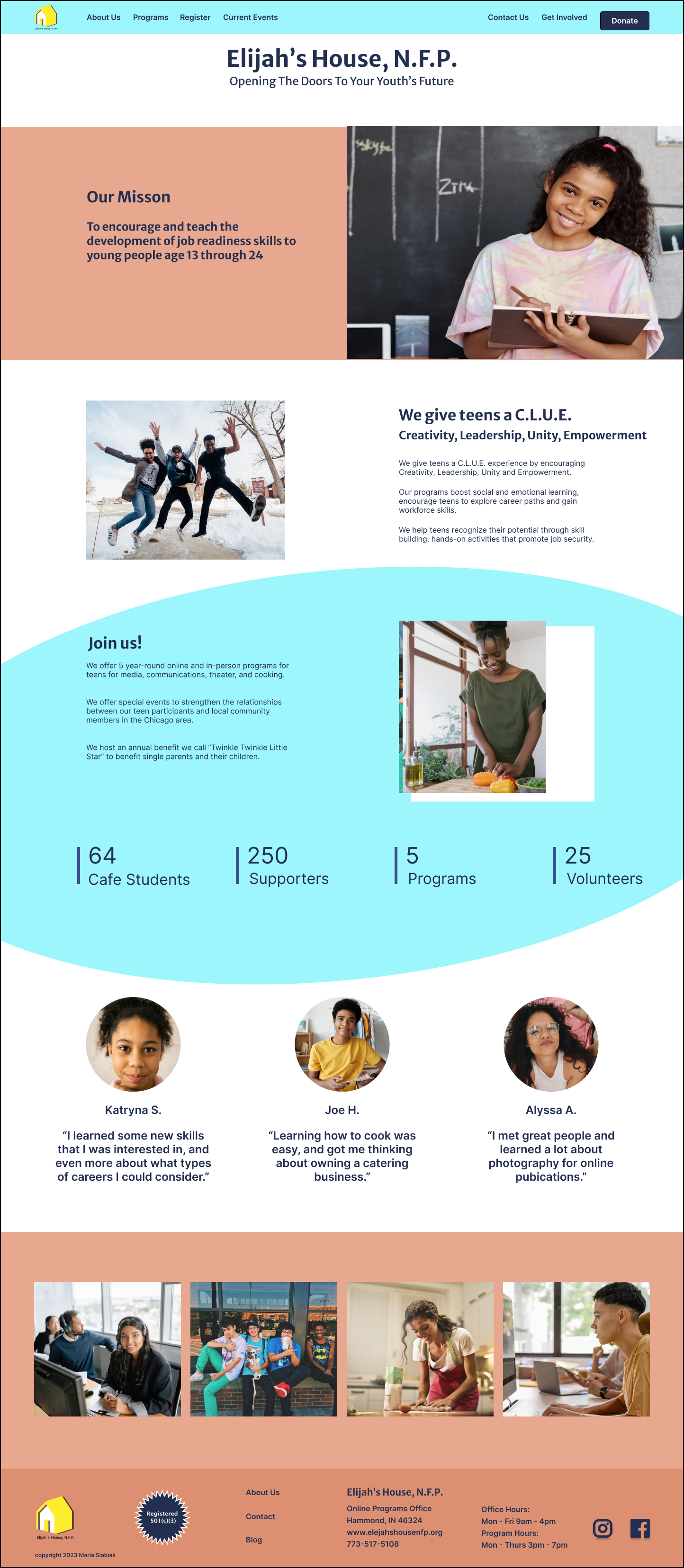
This is how the redesign might look:
Home Page
About Us Page
Retrospective
What worked well:
Prior to the project starting I made a schedule and a list of deliverables. I met with a mentor to get feedback on my approach. They told me my schedule looked realistic, and that I’m a good big-picture thinker. They did suggest I design a few hi-fi designs on my own after the project concluded, so I could present this project as a case study.
As I worked on each item, I tracked my time to help estimating future tasks, and to determine which tasks I would finish before the end of the sprint. I switched to tasks with a higher priority as needed for the sprint demos.
I worked in 1-week sprints, meeting with the client weekly at the end of each sprint. The last sprint was 2 weeks. The 2 week sprint worked very well to finish creating the deliverables and the slide deck. I made quick sprint retro notes after each demo meeting.
The slides were the client education portion of the project, used as a visual reference guide. The client was happy to have the slide deck as a reference.
The 80/20 rule helped me stay focused on the immediate tasks that would bring about the most progress.
I performed separate scans for SEO and accessibility using different tools for each. These tools worked well and I would use them again. I did a page by page audit manually. I combined all the items into another tab for the client to use as a master checklist.
What I would change:
Creating a template and categories in Excel was a bit tedious. Airtable might be a better tool to use, if it is able to meet the privacy needs of the client.


