VocabMaster
A mobile app for learning advanced vocabulary

App Summary
Vocab Master is used to learn advanced vocabulary, primarily for working professionals and students preparing for exams.
This app is for busy people and short study sessions. This app could be localized for other languages.
Why?
At the time this app was designed, based on the competitive analysis, there were no other apps that did an effective job just teaching vocabulary. We could create something useful that filled a gap in the market.
Problem Statement
Users need an app that can increase vocabulary, reinforce long-term retention, and their ability to use these words in real life.
This app could provide:
Flexible learning/practice/quiz modes
Short study sessions
Long-term learning checks
Game options
Scope
User Research | Wireframing | Low-Fidelity Prototype | User Testing
Duration: 5 weeks
-
UX Researcher
UX Designer
-
Pen and Paper
Marvel POP
Figma
LucidChart
-
Competitive Analysis
User Interviews
User Stories
User Persona
User Flows
Usability Testing
Wireframes
Interactive Prototype
User Research
User Interviews
I needed to find out what features would be most relevant, so I began with user interviews.
The interview questions explored learning style, needs, routines, and incentives.
Results
A clean, ad-free interface was more important than incentives and rewards.
Users need repetition and contextual use to reinforce learning.
User stories and job stories helped to define the goals and needs.
-
As a busy professional, I want a tool that can really challenge me at the right level so that I am able to get useful information quickly.
“As a curious learner, I want to be able to absorb the details in the ways that make the most sense to me so that I can learn more effectively.
As someone who can’t always find real life situations to use a new word, having long-term learning checks would help me so I can evaluate my learning retention. -
When I am working on a set, I want several ways to experience the data so it doesn’t get boring.
When I first learn a new word, I like to learn all the detail I can about it, so that I can look for ways to relate it to something I already know.
When I have short breaks in my day, I want to be able to quickly use the app and have it store my progress so that the next time I can pick up where I left off.

Easy
Select the correct level and build from there
Customized
Provide several ways to learn the same information
Long Term
Periodic learning checks over time
Interview Quotes
“I’d rather play a game than study.”
“I’m worried I won’t remember words over time if I don’t use them often.”
“I prefer a lot of choices in my study methods.”
Persona
Since this was a project with a short turnaround, I developed only one proto-persona.
Hypothesis Statement
“We believe that by creating a vocabulary learning app that includes a variety of learning methods, long term learning checks, and affords the user certain levels of control, we will enable users to learn advanced vocabulary more effectively. This in turn will enable them to reach educational and professional goals.”
User Flows
Selecting the Correct Level
Shows how the learner would select the correct level for the type of test they are preparing for, and their current level of mastery.
Adding a Custom Card
Shows the process for adding a custom vocabulary item that might include audio or an image, and how to place it within a vocabulary set.
Wireframes
Paper Sketch for Digital Prototype
I needed to generate a lot of wireframes in a short time, so I used the Crazy 8’s method.
I reached out for mentor and peer feedback to revise the wireframes.
I used Marvel to turn paper sketches into a digital prototype for testing

Usability Testing
4 participants
Mobile device
In person testing
Focus/Goals:
1. Task: Log-in & Select Level
Minimize set-up time
Efficiently select a study level
2. Task: Add a Custom Card
Short process
Test user’s response to options for adding audio and images
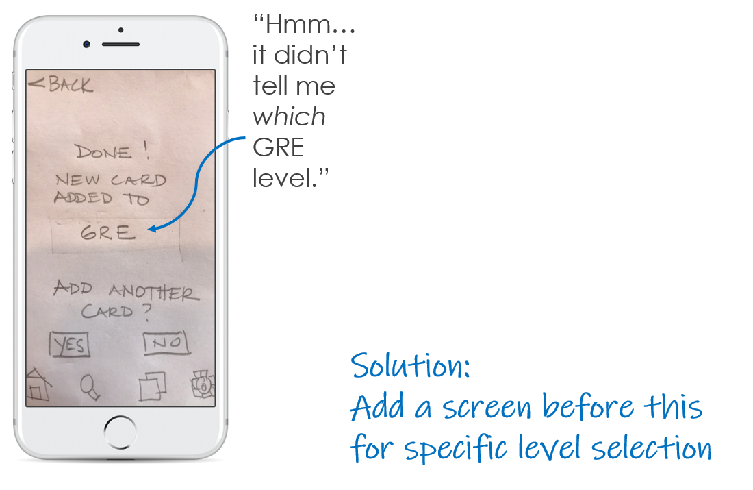
Usability Test Results - What Didn’t Work?


Iteration

Revisions After Usability Testing
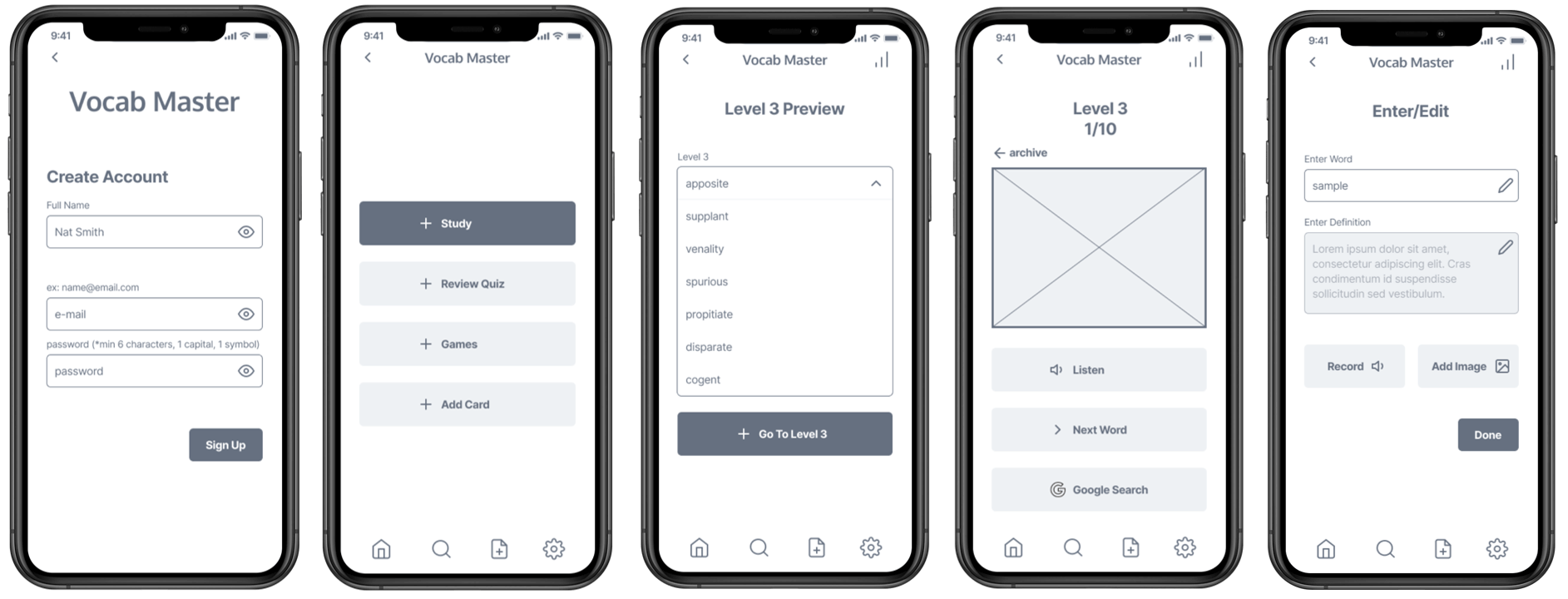
Areas for improvement included more specific labeling, better use of white space, and more items listed here. I developed the revisions into a mid-fidelity digital prototype, initially using Marvel.
Combine screens for Enter Word and Edit/Change
Split some screens into logical separate steps and to improve use of white space
Add back button or home button on all screens for ease of navigation
Add a re-record feature with a “done” button
Add explanation for optional context topics
Add labels to designate which part of the app the user is currently in
Developing Fidelity
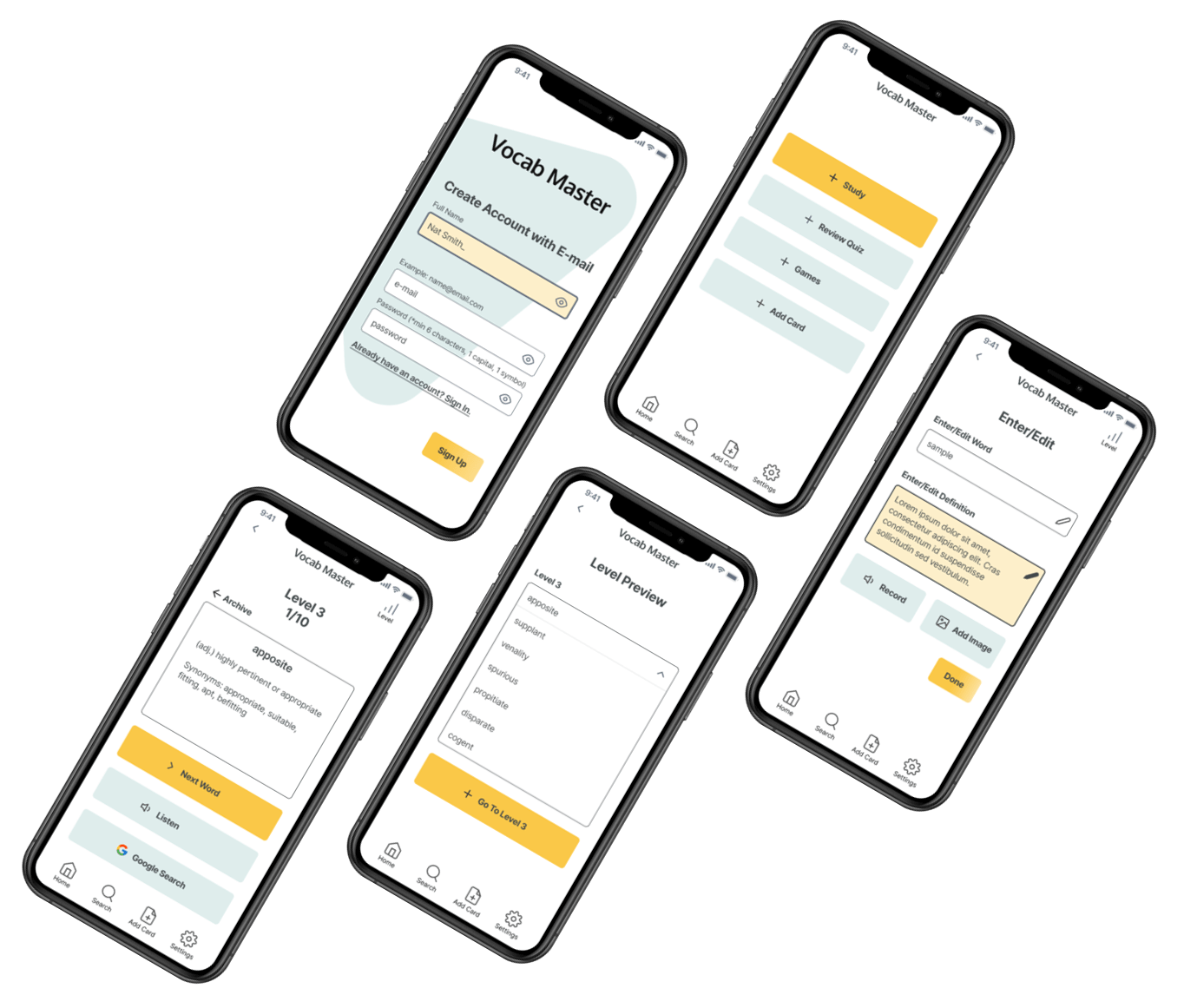
After gaining some experience in Figma, as a UI challenge, I developed the fidelity for some screens a bit further, adding branding colors.
Mid Fidelity Screens
High Fidelity Screens

Takeaways
Difficulties
User interviews, surveys and usability tests all took more time than planned
Learning several brand new tools for this project took a lot of time
Best Practices
Perform multiple rounds of user testing in relatively low, clearly labeled fidelity
Develop your own tools and processes
Fidelity development comes easier with more experience, so continue to practice
Continuous iteration is a necessary part of design
Next Steps
2nd round of usability tests would help to develop:
Game concepts
User Flow for a Pre-Test feature
Card sort for vocabulary levels, utilize field experts
General IU Development, budget permitting
Retrospective
Vocab Master was my first foray into UX. This particular project gave me the opportunity to complete a partial scope of a design in a short time, to consider research strategy and to perform fairly quick research with in-person testing. Although it had more of a standard brief, I could incorporate features that would truly benefit the persona, based on my research.
Knowing nothing about UX design patterns at this stage, I had to rely mostly on user research and peer review. My previous experiences with design are more three-dimensional and experiential, although still based on research and stakeholder relations.
I am always rather curious as to why people react to scenarios and choices, so coming up with the research questions came easily. User flows helped immerse me in the user’s perspective in a tangible way.
Creating wireframes in minutes was challenging, as I worked against the urge to label everything. As it turned out however, my testing participants needed more labeling and less squiggles! Trusting my instincts would have worked.
Turning paper sketches into a working prototype was a real time saver. Compiling the research results was the most tedious. User testing was completed over a span of a few days, to better reflect and summarize between each test. Learning to create the digital wireframes with an unfamiliar tool took extra time, but was definitely worth the experience. After completing the initial project and more studies, I developed hi-fi wireframes as a design challenge using Figma and seeking peer review.


